
Friday, 29 November 2013


Thursday, 28 November 2013

Wednesday, 26 September 2012
T-Hub 2
My most recent project.
Review here http://androidaustralia.com.au/2012/08/reviews/review-telstra-t-hub-2/
And review straight from a customer.
Review here http://androidaustralia.com.au/2012/08/reviews/review-telstra-t-hub-2/
And review straight from a customer.
Thursday, 12 July 2012
Android market share passes 50% in Australia. Time to build your app?
Nielsen just reported that Android has tipped over 50% market share in the US. So how's it doing in Australia? Well slightly better at 56.9% (July 2012).


So if you're organisation proudly released it's iPhone app then perhaps it's time to get going with Android too.

In Australia, Android is gaining share, increasing from 36.4
percent in July 2011 to 56.9 percent in July 2012. Likewise, iOS dipped from
36.9 percent in 2011 to 30.5 percent in 2012. Source: Kantel.
So if you're organisation proudly released it's iPhone app then perhaps it's time to get going with Android too.
Sunday, 20 May 2012
3 essential resources for designing for Android
Firstly, Google's own Android guidelines and resources.
Second, due respect to partner-in-crime Abs for his delightfully simple Android Niceties blog, showcasing contemporary app design.

And finally the excellent Android patterns
Second, due respect to partner-in-crime Abs for his delightfully simple Android Niceties blog, showcasing contemporary app design.

And finally the excellent Android patterns
Wednesday, 9 May 2012
A look into the future - from 1999
"Prediction is very difficult, especially if it's about the future." Niels Bohr
Highlights include predicting the end of boom/bust cycles, that the internet will have less impact on society than aircon as well as pointing out that there are no dotcoms in the Fortune 500 companies (with implication there never will be).
Sunday, 26 February 2012
What's (still) wrong with Android?
The answer is not a lot...
Ice Cream Sandwich on the Galaxy Nexus is a wonderful experience. It pushes the envelope of mobile design and I love it (tick and tick for the 2 goals of Android UX Design Chief, Matias Duarte).

So having used it for 1 month and having put every screen, dialogue and interaction under the microscope, I find only 5 flaws worth mentioning...
Ice Cream Sandwich on the Galaxy Nexus is a wonderful experience. It pushes the envelope of mobile design and I love it (tick and tick for the 2 goals of Android UX Design Chief, Matias Duarte).

So having used it for 1 month and having put every screen, dialogue and interaction under the microscope, I find only 5 flaws worth mentioning...
- Multitasking. Battery life remains an issue so it's time multi-tasking got fixed. Yet I still don't get how to kill an app vs leave it running. Windows had minimize and exit, it was simple and we have a decade of familiarity with it, mobiles need the same.
- Options button. This has been the source of most frustration in our early-use user-testing. Yes it needed removing from the hard keys and yes it was brave to do so. But the "more options icon" and the random placing are a missed opportunity to improve this important feature.
- Play music. To finally beat the iThing you have to get the music player right. A play button is expected to play this track AND those after it. It has since my first walkman and always should. Yet the play button on my Galaxy Nexus plays the current track and then stops. There is probably a gesture or learned behaviour to play all, but I don't know it, which is a nice segue to the next point.
- Having to read the manual. The single most important task to get right is to be able to answer the phone when it rings. I couldn't do it the first time as I had to learn how to answer the phone.
 This to me is heresy, it's a joyful interaction once you've learned it, but it erodes confidence for exactly the user segment that Google now needs to win over. This of course is just one example, there are a few too many areas where I only discovered something by RTFM.
 - It is full of little inconsistencies. Inconsistencies that the average user won't even notice but that will gently erode their trust and love for it. Inconsistencies with earlier versions (OK/Cancel became Cancel/OK), inconsistencies with expected behaviour (the music play button) and inconsistencies within itself (was the Language and input section of Settings done by the same team?)

Monday, 2 January 2012
Outstanding design
It doesn't happen often but here's one of those rare designs that immediately makes the previous best-in-class look archaic. Soon all coffee machines will no doubt look like this. Watch the video for the full picture.


Sunday, 27 November 2011
Monday, 29 August 2011
Do Samsung slavishly copy Apple?
Much has been said about the phones and tablets but here's a comparison of the websites (click image to expand). 
The site of Samsung appears to be paint and brand on top of the same wireframe.
C'mon Samsung, try harder. "Do not seek to follow in the footsteps of the wise. Seek what they sought." Matsuo Basho.


The site of Samsung appears to be paint and brand on top of the same wireframe.
C'mon Samsung, try harder. "Do not seek to follow in the footsteps of the wise. Seek what they sought." Matsuo Basho.
Monday, 18 July 2011
Aussies online
Good Aussie stats are rare indeed, particularly unbiassed ones.
ACMA has recently published "The internet services market and Australians in the online environment" which offers good local data with no hidden agenda and a strong sample size.
Some highlights from my own notes:
10.4 million active internet subscribers in Aus (up 17% for year)
8.2 million mobile handsets (up 21%)
83% of Aussies online, of which 74% daily
$143 billion in online orders last year (up 15%)
3.5 million Aussies interested in Internet TV
2.5 million interested in video call by TV
2.3 million went online to do a VOIP call in month of Dec 2010
8. Data downloaded over mobile up some 462% last year but still 91% of overall data is downloaded by fixed line
ACMA has recently published "The internet services market and Australians in the online environment" which offers good local data with no hidden agenda and a strong sample size.
Some highlights from my own notes:
10.4 million active internet subscribers in Aus (up 17% for year)
8.2 million mobile handsets (up 21%)
83% of Aussies online, of which 74% daily
$143 billion in online orders last year (up 15%)
3.5 million Aussies interested in Internet TV
2.5 million interested in video call by TV
2.3 million went online to do a VOIP call in month of Dec 2010
8. Data downloaded over mobile up some 462% last year but still 91% of overall data is downloaded by fixed line
Sunday, 3 July 2011
On blaming the client
In our industry a poor workman can't really blame his tools so the client is (all too) often framed. Client bagging is tiring to hear and in the long run it can only paint UX in a bad light.
 Jordan Julien from UX Magazine offers some well presented strategies for getting the most from different types of client.
You're not a UX designer if you can't work well with your client. UX is not just about the user it's about internal relationships and doing good business too. As Paul Boag rightly points out;
"The truth is that business objectives should trump users’ needs every time. Generating a return on investment is more important for a website than keeping users happy". Paul Boag.
Read more in his excellent, flame-inviting Smashing Magazine article reminding some in UX to look beyond their monitor and yes, even the user from time to time.
 Jordan Julien from UX Magazine offers some well presented strategies for getting the most from different types of client.
You're not a UX designer if you can't work well with your client. UX is not just about the user it's about internal relationships and doing good business too. As Paul Boag rightly points out;
"The truth is that business objectives should trump users’ needs every time. Generating a return on investment is more important for a website than keeping users happy". Paul Boag.
Read more in his excellent, flame-inviting Smashing Magazine article reminding some in UX to look beyond their monitor and yes, even the user from time to time.
Wednesday, 15 June 2011
Yes, Facebook was designed by Monkeys
Having earlier questioned this based on behaviour of the status update box I can now confirm that Facebook WAS designed by monkeys, having looked at the behaviour of Friends functions.
FOUR links to friends with FIVE different behaviours and no indication of which behaviour to expect.
So:
FOUR links to friends with FIVE different behaviours and no indication of which behaviour to expect.

So:
- Status updates = mess,
- Messages = mess,
- Friends links = mess.
Wednesday, 8 June 2011
Persuasive design toolkit
This Design with Intent research by Dan Lockton is outstanding.
101 patterns for influencing behaviour through design http://www.danlockton.com/dwi/Main_Page
101 patterns for influencing behaviour through design http://www.danlockton.com/dwi/Main_Page
Thursday, 14 April 2011
Was Facebook designed by Monkeys?
A nice simple thought for the day. "Which monkey designed the most popular site in the known universe?"
It's part of our daily lives and we get used to its numerous flaws but here I have 4 different input fields, from the same interface, on the same day, and they each behave differently. Worse still they are core to the experience, being on status updates and messaging.
In some, enter does an old fashioned carriage-return (Gen Y pls see typewriter) and on others it sends your message. I got caught out and sent half written messages and status updates twice this very day.
Presumably they must pay peanuts.
It's part of our daily lives and we get used to its numerous flaws but here I have 4 different input fields, from the same interface, on the same day, and they each behave differently. Worse still they are core to the experience, being on status updates and messaging.

In some, enter does an old fashioned carriage-return (Gen Y pls see typewriter) and on others it sends your message. I got caught out and sent half written messages and status updates twice this very day.
Presumably they must pay peanuts.
Thursday, 13 January 2011
User Centred Design Gold. For FREE
The gold we pan for in User Centred Design is good user input.
The finest gold is that which is genuine and passionate, from the widest range of users and pure (no influence from test conditions). Better still if it was free, ongoing and took little or no effort to obtain then it would leave more time to focus on design.
The rise in popularity of Twitter prior to the launch of T-Hub provided an unprecedented opportunity to observe what real users were thinking about the product.
Previously when you released a product you pushed it out and hoped it was well received. The lucky projects benefited from some user testing but it would be limited in scope, time and the impact of test environment/conditions.
The finest gold is that which is genuine and passionate, from the widest range of users and pure (no influence from test conditions). Better still if it was free, ongoing and took little or no effort to obtain then it would leave more time to focus on design.
The rise in popularity of Twitter prior to the launch of T-Hub provided an unprecedented opportunity to observe what real users were thinking about the product.
Previously when you released a product you pushed it out and hoped it was well received. The lucky projects benefited from some user testing but it would be limited in scope, time and the impact of test environment/conditions.
Product release was akin to putting a bottled SOS message into the ocean. From the shore you can anticipate what the journey might involve and prepare the bottle & message appropriately. Then you can wait for the right tide and weather conditions for success, but without ongoing monitoring and adjustment you have no influence on whether it will reach a target.
With a simple Twitter search and something like Tweetdeck you can see the genuine and unsolicited shouts of hundreds of users in real-time. As tweets are naturally skewed towards the very positive or very negative they are naturally the most useful to act upon. These passionate comments provide a general sense of what people find good or bad as well as pinpoint feedback. Our project has used these to change direction and focus, sometimes quite dramatically. The entire resources of the project has been shifted more than once in direct response to such customer feedback. Like putting a punctured inner tube into water, it is easier to fix a problem if you can pinpoint its location and see how big the leak is.
Thursday, 16 December 2010
T-Hub webmail
This went live in recent days. A clean and simple webmail application for T-Hub that I designed and prototyped earlier in the year. This particular project aimed for simplicity and was notable for the impact that peer reviews had on removing non-core features, which added to the overall experience.
 This particular project aimed for simplicity and was notable for the impact that peer reviews had on removing non-core features, which added to the overall experience.
Tuesday, 2 November 2010
The next internet revolution will be on your TV
Mapping out recent internet evolution I personally think we're in the midst of the 3rd internet revolution and I'm wondering what the 4th might be. The current one (Web 3.0 if you like) is migration from the PC to other devices. Bought about by the migration from heavy specced desktops to netbooks, games consoles (increasingly internet/media devices), smartphones, iPads/tablets and next to TVs.
 The following factors all indicate that the TV is the next big thing set for revolution, and a revolution in which Google TV is very much the tip of the iceberg:
 The following factors all indicate that the TV is the next big thing set for revolution, and a revolution in which Google TV is very much the tip of the iceberg:
- The big players lined up to merge internet and TV
- The cloud and thin client are now ready
- A growing preference for streaming over downloading, renting over owning. Watch once & discard.
- Disillusionment with a plethora of boxes and remotes by the TV
- HTML5 and upcoming browser based, thin client Chrome OS
- Set top box/games console/HDD recorder etc are ripe for abstraction to SAAS
- eCommerce went from PC to smartphone but its natural home is surely our TVs
- Skype-like services are already migrating to the TV
- The home network and multi-device homes are the norm
- The (Australian) Government is spending $43 billion on a National Broadband Network. What media needs fat pipes? HD Video. Where does HD video belong? The biggest screen in the house.
Monday, 18 October 2010
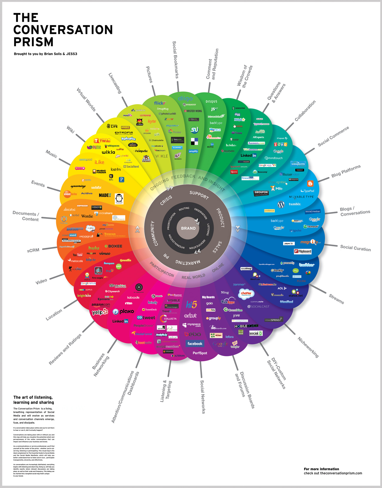
28 flavours of online conversation in 2010
This chart has everything for me. Symetry, colour, purpose, beauty and infographic glory. Form and function.
 Source article and supporting commentary here.

 Source article and supporting commentary here.
Subscribe to:
Posts (Atom)